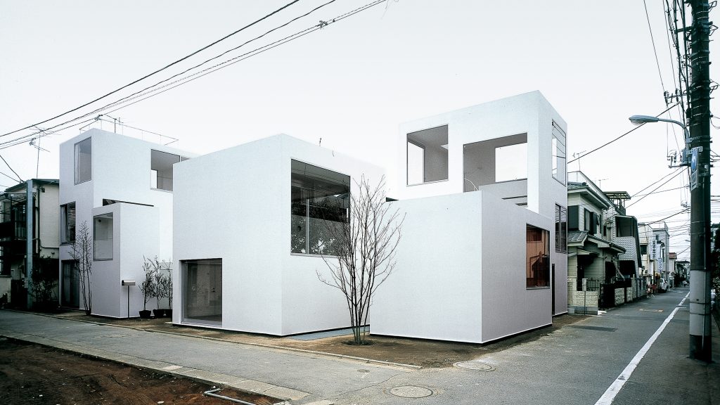
I have chosen the Moriyama house by the architect Kazuyo Sejima dating from 2005 and located in Ohta-ku, a residential neighborhood in central Tokyo dominated by the presence of single-family homes and medium-sized apartment blocks, arranged on a traditional urban layout in which a typically Japanese atmosphere is preserved. Inspired by the reflection of the accelerated growth process of the capital, the house reinvents the concept of traditional Japanese housing by distributing on a 290 square meter plot a set of independent volumes among which the owner’s home and, temporarily, five rental apartments are distributed.
In order to respect the morphology of the surroundings-an urban landscape characterized by the repetition of buildings over a labyrinth of narrow passages-instead of concentrating the program in a single volume, the space has been fragmented into autonomous units that allow for small gardens and interconnected courtyards between the units, which function as meeting places for the tenants and accentuate the sense of belonging to a neighborhood community. Despite the proximity, their privacy has been achieved by taking special care with the shape of the enclosures, the position they occupy on the plot, the distances between them and the arrangement of the openings on the facades to avoid facing each other.
Each volume, built with thin structural panels of sheet steel, is distinguished from the rest by its size, proportion and number of floors, and can contain anything from a complete apartment to a simple residential unit. Currently, the client’s home occupies a single volume on the plot, distributed over four floors containing a studio, living room and two bedrooms. The rest, conceived as a set of small enclosures, are used as rental apartments, although in the future they will end up being part of the owner’s dwelling.
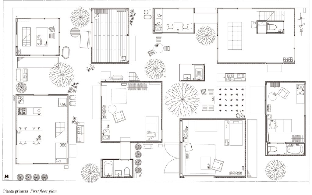

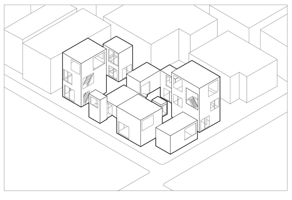
Firstly, the Moriyama House has a rhythm of horizontal lines and a sense of progressive transparency. The house consists of several distinct blocks that are connected to each other in a linear axis, which gives the house a sense of direction. The project is symmetrical in plan, with the central axis being the main feature of the house.
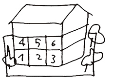
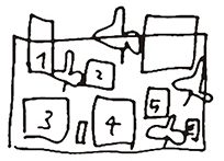
Moreover, it has a hierarchical system of spaces, with the ground floor having the most public spaces and the upper floors being more private. The buildings are constructed using a modular system, with the modules varying in size and shape to create different effects. The house is organized in a grid pattern, with the columns and beams arranged in a regular pattern. Indeed, the project is planned thinking about a traditional house that is decomposed in various modules following a certain hierarchy and grid.
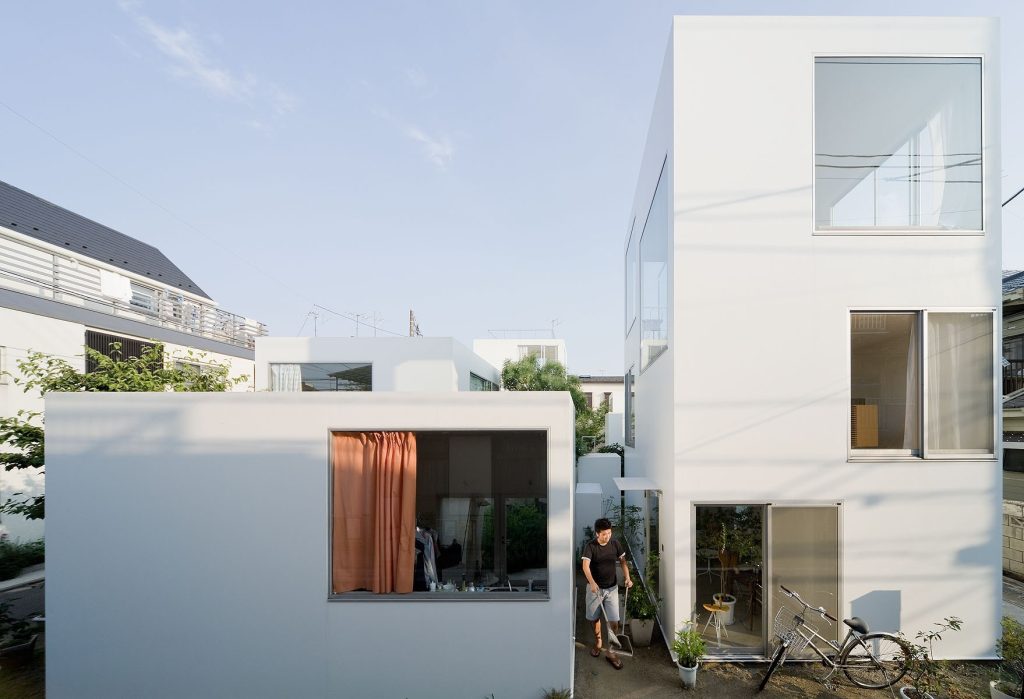

The movement through the house is designed to be dynamic and fluid, with an emphasis on visual continuity and connection between spaces. Althought, the buildings are unified by its use of a single material and a consistent visual language.
Another important factor is balancing, the house is balanced between its private and public spaces, with the courtyard providing a connection between the two. It is also take use of centricity, around a central courtyard are displaced the other rooms radiating out from this point.
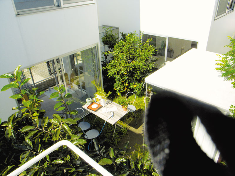
The limits of the house are defined by its exterior walls and its interior walls, which create distinct spaces and provide a sense of enclosure. An essential parameter is natural light is used to create a sense of openness and transparency within the house. The contrast between the interior and exterior walls of the house creates a sense of depth and space. The colours are predominantly white, with accents of grey and black used to create contrast and visual interest.

The use of different textures and materials creates a sense of tactility and visual interest. Moreover, the house is designed in proportion to its environment, with the windows and other elements balanced in relation to the exterior walls. Finally, the scale of the house is kept small to ensure that it fits in with the surrounding environment.
